A Semester of Failure, Pivots, and Desire with the STAC Research Team
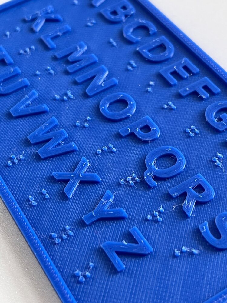
Checking Out the World of 3D Printing
A Semester of Failure, Pivots, and Desire with the STAC Research Team
The STAC Research Team operates out of 746 STAC, also known as the Gallatin Makerspace. STAC stands for Science, Technology, Arts, and Creativity, and the Research Team comes together to discuss readings and work on projects central to these subjects. In the fall 2021 semester, the STAC Team’s tutorial was focused on Eve Tuck’s concept of desire-based research. Eve Tuck is an Indigenous scholar who does work on urban education and Indigenous studies. In “Suspending Damage: A Letter to Communities,” Tuck describes desire-based research as “concerned with understanding complexity, contradiction, and the self-determination of lives . . . Even when communities are broken and conquered, they are so much more than that.”1This contrasts to damage-centered research in Indigenous and POC communities, which has become the standard. In Tuck’s view, damage-centered research “intends to document peoples’ pain and brokenness to hold those in power accountable for their oppression.”2As we neared the end of that semester, we began to think about projects that we could take up in the spring that would allow us to put to use these desire-based research concepts. We came across a tweet that showed a picture of a tactile map of the Union Square subway station, and began to consider the prospect of taking up a tactile mapping project. The Twitter thread showed that the process of creating and printing tactile graphics could benefit from an open source method and tools. We realized that it would be beneficial to focus on both designing a tactile map of NYU and developing an open-source process for people to follow to create and 3d-print their own tactile maps.
My husband responded to my confusion and woe trying to understand Union Square station by doing in two hours what the MTA will not, and creating a tactile map of the place. This is a prototype but it only took a few minutes touching and talking it through to build a mental model. pic.twitter.com/mxpRaJQ7MN
— Chancey Fleet 🌈👩🦯 (@ChanceyFleet) September 12, 2021
At the beginning of the spring 2022 semester, the STAC Research Team members split into different project groups. The four of us—Bea Barrett, Clara Luce, Gabriella Geis, and Hannah Young—joined the tactile mapping group, and the other members of the STAC Research Team joined the vertical gardening group to develop a plan to build a vertical garden at Gallatin. With only the knowledge of this tweet and a general idea of what tactile maps were, we began thinking about how this project could be beneficial to the Gallatin and the greater NYU community. We thought of creating tactile maps of the different floors at 1 Washington Place, a bigger tactile map of the NYU buildings surrounding the park, or tactile maps of other highly trafficked buildings on campus. Our general goal was to develop an open-source process to turn flat maps into 3D printable files that could be printed for free in the Gallatin Makerspace for the NYU community to use.
Starting Out: Looking at What Already Exists, Preliminary Research
Initially, we tried to reach out to others who had been successful in creating tactile maps before. The main example we found was at Rutgers University; a 3D printing group had successfully created tactile maps based on a set of floor plans. Their small group of engineering students was able to create a more accessible way to experience the Alexander Library. We decided to reach out to both the team that established this protocol as well as the professors who had overseen it.3
However, much to our dismay, Rutgers staff and students were either unable or unwilling to share information about their process with us. This left us frustrated; what we wanted to do seemed so simple: turn a floorplan into a 3D printed version of the map. However, a major challenge revealed itself as we struggled to find out how to change flat blueprints into tactile maps. It wasn’t as simple as we’d first thought, and it was disheartening to know that someone else had been successful but wasn’t able (or willing) to clue us in on this process. We were also unsure of the best way to make these blueprints both usable and ADA compliant—which is something we will expand upon later.
So, we set out on our own. We realized that we would need to translate maps into the vector files—necessary for printing—if we wanted to have any hope of creating the 3D version. We explored a few different ways of doing so—Procreate and Adobe Photoshop were the main areas of interest; however, they didn’t turn out to be too effective. Though the software was somewhat user friendly, we found it to be inaccessible due to price. Moreover, the maps didn’t necessarily scale properly or include all of the details we would deem necessary. Thus, the end goal of the project, which would be a detailed instructive manual on how to create one of these 3D printable files from any map you have available, no longer seemed tenable. Therefore, we decided to look into different modes of 3D printing—maybe Inkbox or other more user-friendly software would lead to a more tangible payout. Maybe this way, a user with less financial capital would have access to the necessary software. Or perhaps, it would be easier to go back and edit these files. But unfortunately the change in software was not conducive to this flexibility in price nor in functionality.
There are multiple ways to convert a PDF file to a STL file—these are files properly formatted to work with 3D printers, similar to vector files, but oriented on a more dynamic three dimensional plane—but none of them were particularly attainable. Initially, an option would be to find a way to input a PDF into some sort of preexisting program that would allow us to automatically change these PDFs into high quality vector images that can be scaled to our needs without sacrificing image quality. The issue with this was that these programs are exorbitantly expensive–they’re about twenty dollars on the cheaper end, and the most effective and user friendly programs, in the aforementioned Adobe Suite, require a monthly subscription fee of fifty-five dollars. Then, even if attaining the software and making the file was achievable, we would have to scale it and essentially form a 3D model from the ground up. Not only is this inefficient, but the expense of the programs required to accomplish this makes our plan for creating accessibility tools rather . . . well . . . inaccessible. Our goal was to find cost-effective and user-friendly ways to walk people through the process of converting a flat map to a tactile and thus more accessible version, and after a significant amount of work on our end, we realized that for the time being there is not enough open-source technology for this purpose.
Of course, after hours of trial and failure, we considered the prospect of doing it the old-fashioned way. Perhaps if we had the actual dimensions of a space, we could create a 3D model without having to go through the expensive and time-consuming process of converting flat map files into the format a 3D modeling program could use. However, there was not technology that was accurate enough in helping us measure the spaces available through open sources, and the physical process of doing so would be unrealistic for some disabled folks to undertake. In short, we realized that the process of figuring out the dimensions of a space could be just as inaccessible as being able to navigate said space in the first place. And engineering technologies that exist for the purpose of gathering dimensions were, again, either inaccurate or financially inaccessible. We wondered if this would seem more achievable if we narrowed down the scope of our goals–perhaps we didn’t need to start from flat blueprints, even if that was the ideal process we were trying to hone. After all, each floor of 1 Washington Place has images of the floorplans depicted in relief next to the elevators. But when we went to investigate these maps from an accessibility angle, we realized they had limited information.
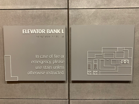
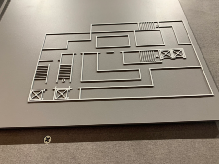
There was no braille apart from “ELEVATOR BANK L” (which was already written in raised lettering), nor was there any space to depict the room numbers. We realized that this was not much of a better starting point than with flat maps. This led to our scope narrowing even further—okay, maybe if we couldn’t map all of 1 Washington Place, we could focus on a single floor or even a single room by using apps and other tools that allow engineers to get a sense of space and size. But, after giving this a fair shake, we concluded that the effects of our narrowed vision were going to be far less effective than we had hoped. The means that we had access to were not accessible for the general population, thus, we would be unable to create a universally accessible guide for transferring flat maps to 3D STL files. Then, we realized that even if we were to create a process that was accessible and relatively infallible, the maps themselves would often fail to provide enough information. Tactile maps that only demonstrate space and size wouldn’t necessarily give all of the necessary information required for people to navigate through these spaces safely and mindfully, rendering them far less worthwhile. Therefore, we decided that there could be better and more accessible uses of 3D printing technology that were neither too complex nor financially inaccessible. We just had to find them.
Reaching Out: Meetings with Accessibility Specialists
Through Cyd Cipolla, Director of STAC and our faculty advisor for the “Desire-Based Research” tutorial, and Lisa Daily, Director of Community Engagement and Associate Faculty at Gallatin, we were able to meet with Andrea Wallace, Statewide Educational Specialist for the Visually Impaired for the Florida Instructional Materials Center for the Visually Impaired. She and one of her colleagues gave us a lot of information about different assistive technologies. They use a more old-school way of making tactile maps with crafting supplies and shared with us some of the materials they use such as thermoform paper, pipe cleaners, corrugated cardboard, and wood pieces. Still, they, too, were excited about possibly having access to a more high-tech version of tactile mapping with 3D printers.
They also shared with us some of the important standards and conventions to follow when making a tactile map. First, the tactile elements should not be too close to the edge of the base layer, that way they can be discerned easily through the fingertips. There also should be no more than five distinct textures present on the map; anything more could be too complex and hard to read. After discussing the standards for a while, we understood that following conventions would be very important. Otherwise, the maps we created would not be readable.
To move forward, Wallace and her colleague shared some resources with us to help point us in the right direction. They introduced us to American Printing House for the Blind, which is where we would eventually get some of the 3D printing files. Wallace and her colleague also shared programs like Tiger Software suite, QuickDraw, and Tactile View which they use with their embosser.
In addition to an introduction to the technologies that are currently available for creating tactile maps, Wallace and her team also discussed how to make these tactile maps ADA compliant. The overarching theme in our discussion was about the difficulty that you encounter when trying to develop new technologies in order to make them ADA compliant. Regarding the creation of tactile graphics or maps, these difficulties include taking into consideration the spacing and placement of the elements you want to include, the ability of the graphic to be understood easily through the fingertips, and the graphic not contributing to too much mental overload in terms of the textures used and the amount of information provided. We were directed to Lucia Hasty’s Tactile Graphics website to understand these guidelines to a greater extent and to learn more about how to make ADA-compliant tactile graphics and maps. Prior to this meeting, we had not seriously considered how we would label the elements that we wanted to include in our tactile maps, as we had mostly just focused on thinking about how to design shapes and graphics.
Additionally in the meeting with Wallace and her colleague, we learned more about the braille translation process and the software that is necessary to accurately translate from text to braille. Wallace recommended the Tiger Software Suite software which includes a braille translator and is used in combination with embossers, machines that press 3D texture into paper and plastic to create raised patterns. We encountered obstacles when we began to investigate the prices of these softwares and machines. The software costs anywhere from two hundred to six hundred dollars, and the cheapest embossers start in the mid-thousands of dollars. This meeting brought to light the numerous expenses necessary in the current process of creating tactile graphics as well as the extreme care necessary in creating useful tactile graphics. Since we are aiming to keep the outcome of this project accessible to all regardless of access to software, we decided to not use expensive software.
Our conversation with Andrea Wallace revealed how inaccessible most assistive technology is, both due to complexity and price point, and also how large the demand for that technology is. It also gave us a better understanding of why these accessibility tools are not widely in use. There are so many resources and technologies required that only very few can invest in.
Reaching out further, we decided to send an email to Gallatin students whose interests aligned with the major themes of our project. As we were searching for ways to move forward, we hoped that involving more students would help us to brainstorm how to tackle the project. The email we sent had a Google Form attached where respondents were asked to describe their interests and relevant skills as well as indicate their desired level of involvement. Six Gallatin students with academic interests in disability studies who were interested in hearing about our project responded.
We reached out to the Google Form respondents and invited them to meet with the rest of our team to get more information about the project. One student attended one of our regular team meetings to learn about the project, and we invited others to attend over Zoom. We had a bit of a rocky start and no one attended our first informational Zoom meeting. It was scheduled right after spring break, and we were hoping that was responsible for the low attendance. We scheduled another meeting later in the semester to hopefully garner more interest, and one person attended that meeting. This attendee, however, did not express any further interest in being involved with the project. It was discouraging to have a list of people interested in the project, but have such a low turnout for our information sessions. It seemed to show that these assistive technologies are needed and there are people interested in working on them, but we struggled to gather the momentum to get them involved.
Still, our efforts did not go to waste. One conversation that was able to come out of this Google Form was a meeting with Lisa Gayhart—the Director of User Experience at Bobst Library working to improve/develop NYU’s accessibility initiatives. We discussed the curre5 All of this being said, tactile maps of NYU Libraries don’t currently exist in any real capacity (and Gayhart told us that even the traditional visual maps are confusing), so if we were able to find a way to effectively and inexpensively 3D print tactile maps, NYU Libraries would be very interested in accepting them. Until this semester, NYU Libraries had pretty strict rules and procedures surrounding high-touch objects such as books, but they found that these procedures neither hindered nor increased the spread of Covid-19, so we would not have to take these things into consideration. Ultimately, because this is a low-stakes student project, the library wasn’t looking for any strict commitments and is open to a long-term partnership that changes as our project changes.6
Down and Out: Trying to 3D-print Our Way Out of a Rut
After these meetings, we felt incredibly lost. At the time we wrote: “between ADA compliance, the complexities of braille translation, and cost of machinery, we are now reminded of the fact that capitalism hates disabled people and has done everything in its power to make their lives more difficult and reserved all accommodations to those that can turn a profit.” This immediately followed the Zoom meeting for the people who had responded to our Google Form that nobody had attended, and in general, we were just feeling lost as it set in that our initial project goal of creating tactile maps for NYU buildings was not going to be possible this semester.
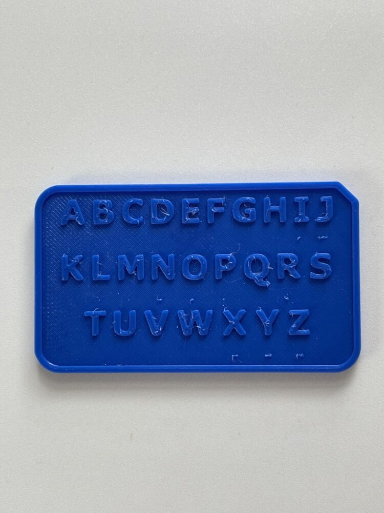
In an effort to achieve something tangible, as a group, we decided to begin 3D printing accessibility tools. We started with printing a deaf blind pocket communicator from American Printing House for the Blind. This tool is also available for purchase on the American Printing House website, but they also provide the files to 3D print the tool yourself.
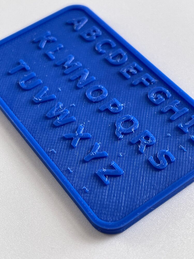
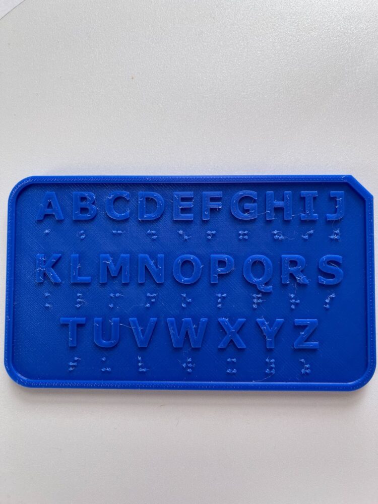
Our first attempt at a pocket communicator.
Our first attempt at a pocket communicator.
Our first attempt at a pocket communicator.
Our first attempt was rather unsuccessful; the braille on the communication card was so fragile that running your finger over the top of it would scratch away the bumps. This communicator was printed at a resolution of .20 millimeters, meaning that each layer of plastic printed is .20 millimeters thick. In order to fix the issue of printing braille, we decided to print the communicator at a higher resolution. Printing at a higher resolution means printing in smaller layers of plastic, this allows the printer to create more precise details.
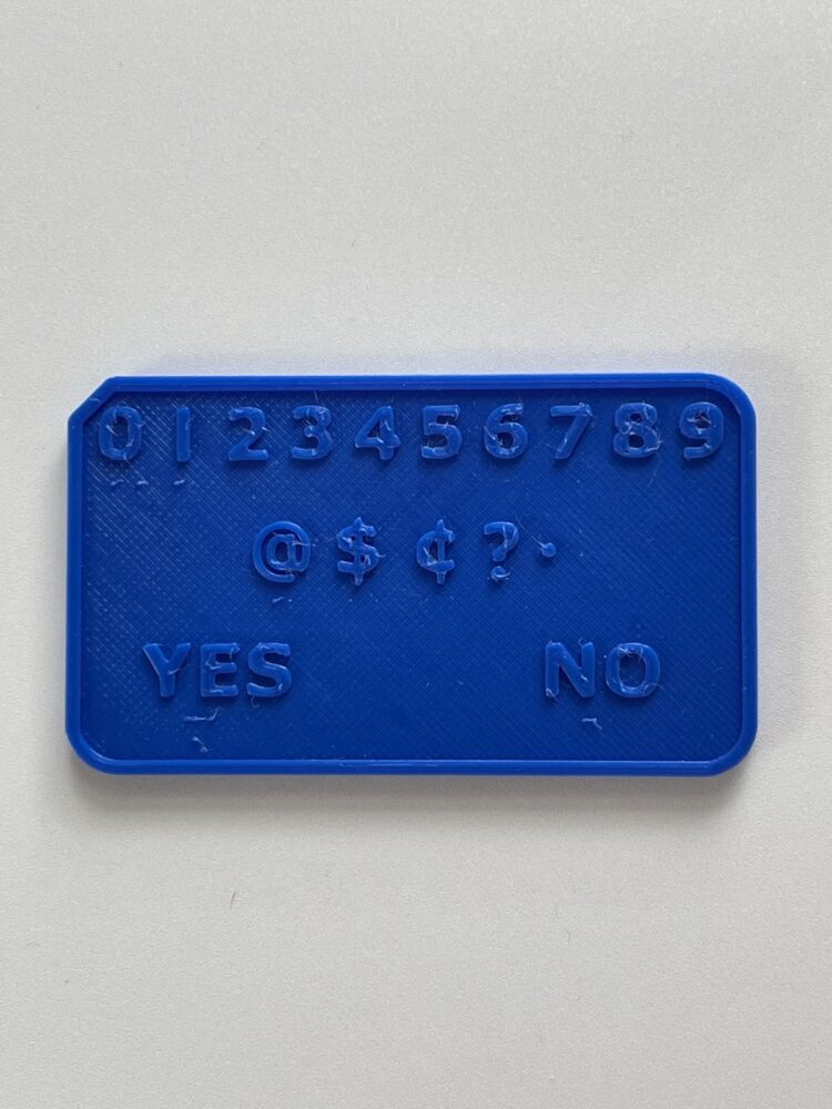
Our second attempt at a pocket communicator.
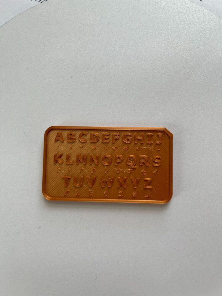
Our second attempt at a pocket communicator.
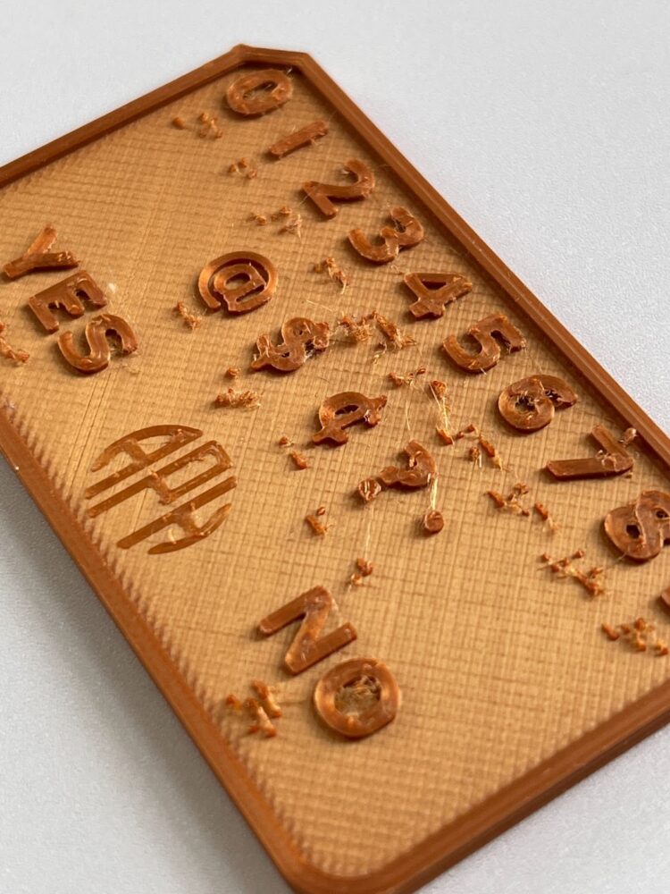
In 3D printing, the higher the resolution the more detail you can achieve in the final object. We hoped that increasing the resolution to the maximum setting of .05 millimeters would allow for the braille to be sturdier. The next print was slightly more successful, the braille no longer comes off easily, but it is very scratchy, which makes it difficult to feel the location of each of the dots.
Our third attempt at a pocket communicator.
Our third attempt at a pocket communicator.
Slightly discouraged, we pressed forward with another 3D printing attempt. This time, we printed at maximum resolution and increased the size of the pocket communicator in hopes that things would end up smoother. This was our best attempt at printing the Deaf Blind Pocket Communicator. It is by no means perfect, but the braille is much smoother and stronger than in the previous two attempts. The only downside is that it is much larger, and would be bulky to keep in your pockets.
Our struggles with 3D printing this object demonstrate the complexity of the 3D printing process. Even though the file from American Printing House for the Blind was meant to be 3D printed, it is difficult to get such small details on most household 3D printers. The most common type of 3D printing is Fused Deposition Modeling (FDM). This type of printer adds layers of hot plastic on top of each other to build out the 3D shape. This is the type of printer that we used in our attempts at printing this tool, and likely why we struggled to get the detail needed for printing braille. There are other 3D printing methods, like resin printing, that can achieve more detail and create a smoother outcome. The downside is that these machines are expensive and not commonly accessible to the average person. If people have access to a 3D printer at all, they are likely to only have access to FDM printing, which is not precise enough to print small details like braille.
At this point, we accepted the mediocre success and decided to move on to print other accessibility tools. The first tool we printed was a bag holder. This tool is meant to make it easier for people to carry their groceries if they have difficulty using traditional shopping bag handles. This print went smoothly compared to our earlier attempts, and our first try was a success. In order to get some feedback on this tool, we had a classmate test it out. They reported that it was not catered to shorter people because the bags would drag on the ground.
One Final Reroute: A Happy Coincidence and the Beauty of Community
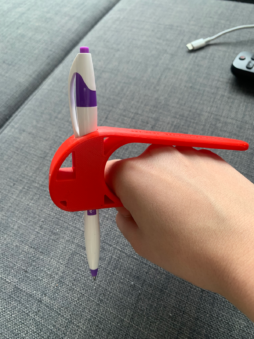
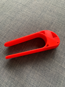
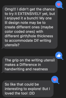
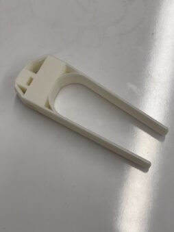
We have continued to print various accessibility tools and have given them to people who need them. One of the members of the research team hurt their elbow last week but wanted to use a screwdriver, so we printed a Palm Pen Holder, a device used by people with low mobility in their hands to use writing utensils, from the Temple University Maker’s Catalog, to see if this catalog could also be helpful for other kinds of tools. Although that student left before the print had finished, by a happy coincidence, one of our team member’s friends, V, stopped by to pick something up that they had left at their apartment when that team member spontaneously remembered that V has tendonitis and can’t write by hand for long periods of time. We gave V a palm pen holder to make writing more comfortable. They stated that “the grip on the writing utensil makes a difference in handwriting and neatness,” but also noted that creating different sizes that are color-coded to fit different sizes of writing utensils.
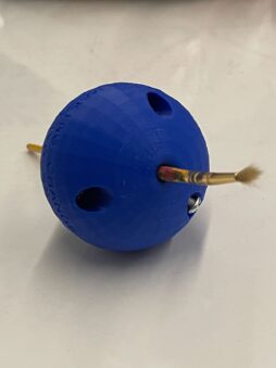
Given this feedback, we decided to try printing a different model (the 3D Printed Pen Ball Holder from Makers Making Change) with a smaller (five millimeter diameter) hole (compared to the thirteen millimeter diameter hole on the last model). This ended up being a bit of an overcorrection on our part, as we realized that the diameter of hole was too narrow to fit a pen or pencil and the only utensil that it could fit was a thin paintbrush. We decided to assemble the Pen Ball anyway and keep it in the STAC room for students to use if they should need it, and then we moved on to addressing V’s design note.
Instead of trying to take V’s exact advice and make multiple different Pen Holders, we decided to find a design that could accommodate a variety of tools. Using the same website as the Pen Ball, Makers Making Change, we found a 3D print file that included a setting screw where “a pen or pencil is inserted through the Palm Pen Holder pen hole and is fixed in place by tightening a set screw to allow for different writing utensil sizes.”7 This is the latest development in our project, so we are currently setting up a time to get this tool to V to see how the user experience is!
Overall, our 3D printing attempts reemphasized the complexity of this project and prompted us to pivot towards a more general goal of creating 3D printable accessibility tools. Our difficulty printing braille could likely be resolved with lots of fine-tuning, and at the very least it can be further improved. Regardless, it was rewarding to provide tools to people who need them and receive their input in return for further improvements. At the very least, we were able to learn about 3D printing accessibility tools which can inform future explorations into creating tactile maps.
The Turn Out: Final Reflections and The Queer Art of Failure
As we explored this project, failure became an important theme for the team. We all had to face the fact that we were not going to achieve our original goal and grapple with what that meant for our project and for the community of people who need the tools we originally set out to produce. Failing is undoubtedly an important part of any experimental project like this, and we were able to learn from our failings to move forward. We learned to take failure not as an endpoint, but rather as a redirecting force. Rather than dwelling on what we were not able to achieve, we pivoted, and redirected our original goals to fit the resources we had available. It was difficult to come to terms with the fact that we would disappoint all of the people we had spoken to who were so excited about what we were setting out to do.
As we faced our failures, we started asking ourselves what it means to fail. What does it mean to fail to achieve your goals? And how does it affect the people we set out to help? What does it mean to publish and make public our overall failure? I don’t think any of us have complete answers to these questions, but simply by asking we realized how important our failures were in guiding us to new and unexpected pathways for moving forward. For example, after our three less than perfect attempts at printing the Blind Deaf Pocket Communicator, we were led to more simple accessibility tools. These were the tools that ended up connecting us to an individual who could actually use the assistive devices. If we had ended our 3D printing explorations with that failure, we never would have been able to provide V with any assistive technologies. It was wandering through our failures that led us to the most impact. As Jack Halberstam says in The Queer Art of Failure, “failing, losing, forgetting, unmaking, undoing, unbecoming, not knowing may in fact offer more creative, more cooperative, more surprising ways of being in the world”8 As our continuous failures built up throughout this project, we were led to unexpected places that taught us more about our project than a pure success could have ever allowed.
- Eve Tuck, “Suspending Damage: A Letter to Communities,” Harvard Educational Review, Volume 79, Issue 3 (2009): 416.
- Tuck, “Suspending Damage,” 409.
- “Tactile Maps, Created by Engineering Students, Help Blind Visitors Navigate Alexander Library,” Rutgers University News, October 12, 2018.
- nt state of accessibility initiatives at NYU Libraries which have mainly covered screenwriting and captions, but Gayhart informed us that there is also a proposal for a new sensory room.4Sensory room definition: “a therapeutic space with a variety of equipment that provides students with special needs with personalized sensory input—helps [them] calm and focus themselves so they can be better prepared for learning and interacting with others.
- At first, we were hesitant to include the interview with Lisa Gayhartin this piece given the fact that this partnership never really produced any tangible results for our team. However, we realized that “irrelevant details” such as these still illuminate the complete, messy, mistake-driven process even if we do end up pivoting later on. For one, all four of us are graduating, so if underclassmen wanted to pick up where we left off, we have now saved them the trouble of going down the same dead ends. Additionally, this interview shows that despite all of this interest and need by multiple parties, we were still unable to overcome the obstacles we needed in order for our desires to come to fruition.
- “Palm Pen Holder,” Makers Making Change, accessed April 26, 2022.
- Jack Halberstam, The Queer Art of Failure (Duke University Press, 2011), 2.